Hopper

Hopper

Hopper

Hopper

Timeline

4 weeks

Timeline

4 weeks

Timeline

4 weeks

Timeline

4 weeks

Year

2022

Year

2022

Year

2022

Year

2022

A travel app that utilizes machine learning to predict trends, enabling users to find the best deals on flights and hotels

A travel app that utilizes machine learning to predict trends, enabling users to find the best deals on flights and hotels

A travel app that utilizes machine learning to predict trends, enabling users to find the best deals on flights and hotels

The goal of this project was to increase conversions on hotel booking from users arriving on the website since most booking happen through the mobile app

Timeline

4 weeks

Role

UI / UX Design

UX Research

Background

Hopper is a mobile app and web experience that helps users find the best deals on flights and hotels. It uses data analytics and machine learning algorithms to predict airfare trends and recommend the optimal time to book. With its user-friendly interface and personalized recommendations, Hopper aims to make travel planning easier and more affordable for everyone.


Problem

One of the main challenges for hopper web is prioritizing all the ideas and features that users love on the native mobile app (Watch, Price Freeze, VIP support) into the responsive web experience. The current focus for Hopper Web is to improve the conversion rates for hotel bookings, while not sacrificing their revenue per user.


Objective

Analyze the existing mobile experience and competitor's experiences to pinpoint what new features and improvements should be added to the responsive web experience with the goal of increasing conversion.



First thing I needed to do was empathize with the users by analyzing the current experience and talking with some humans


Evaluating the current experience

To get a better understanding of how to make improvements I audited the current experience by pinpointing areas for improvement and conducting a heuristic evaluation to identify usability issues.


Speaking to some users to get a sense of what they wanted

I conducted user interviews while they used the site to gauge how they felt about the current experience and find out which new improvements should be prioritized.


Getting a sense of what their competitors were doing right

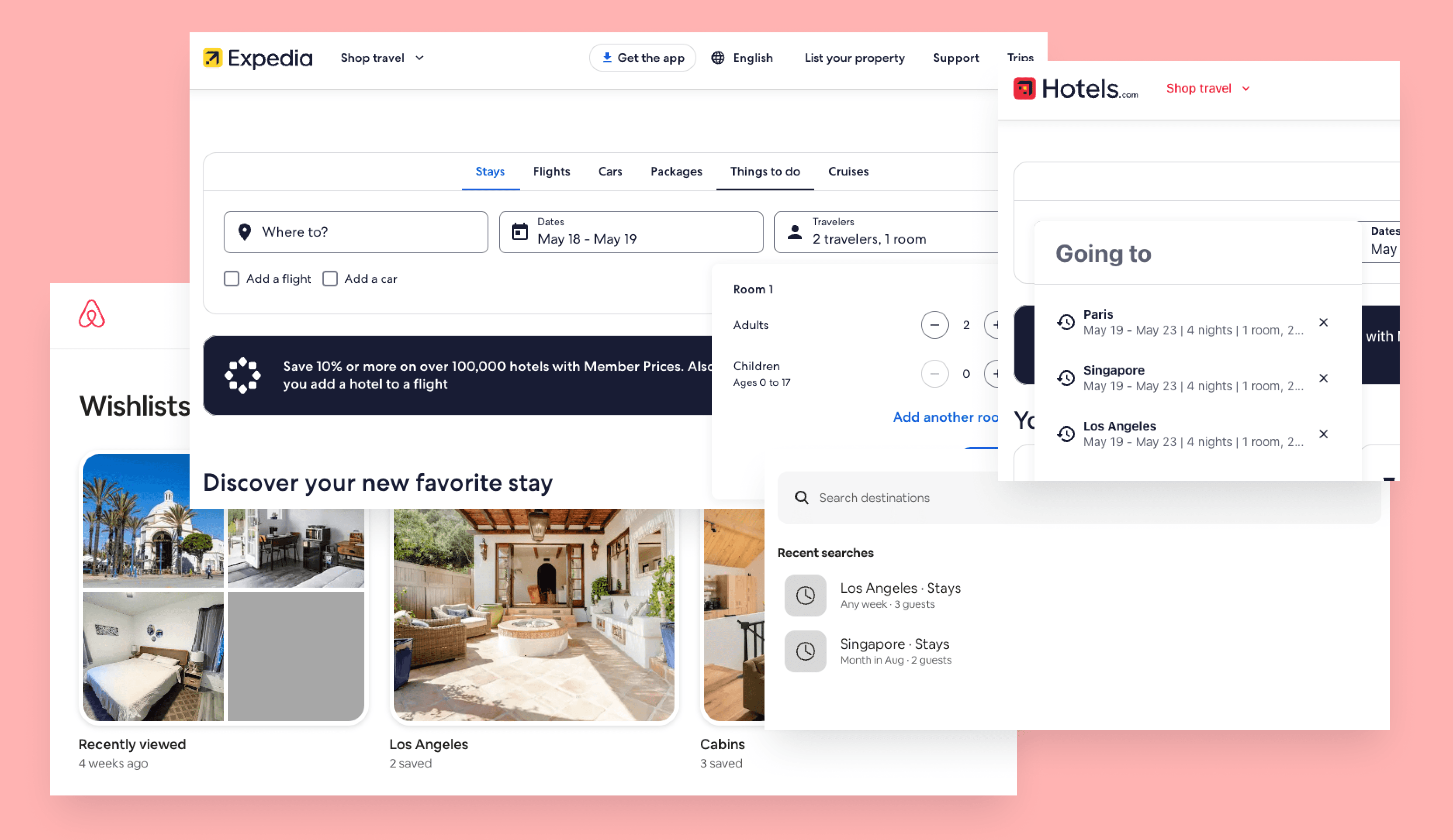
By comparing the user experience of competitors' products it helped me to benchmark hopper's web product's usability, functionality, and overall user experience. This helped me to highlight which features were ultimately missing from the experience to stay competitive in the travel booking space.


The next step was to conceptualize the improvements that should be prioritized


Iterating on a wireframe flow to pinpoint which improvements to make

Based on the research I conducted, I created multiple iterations of the proposed flow to get feedback from the team and to pinpoint which changes to make.




With the proposed changes decided it was time to Design the improved experience


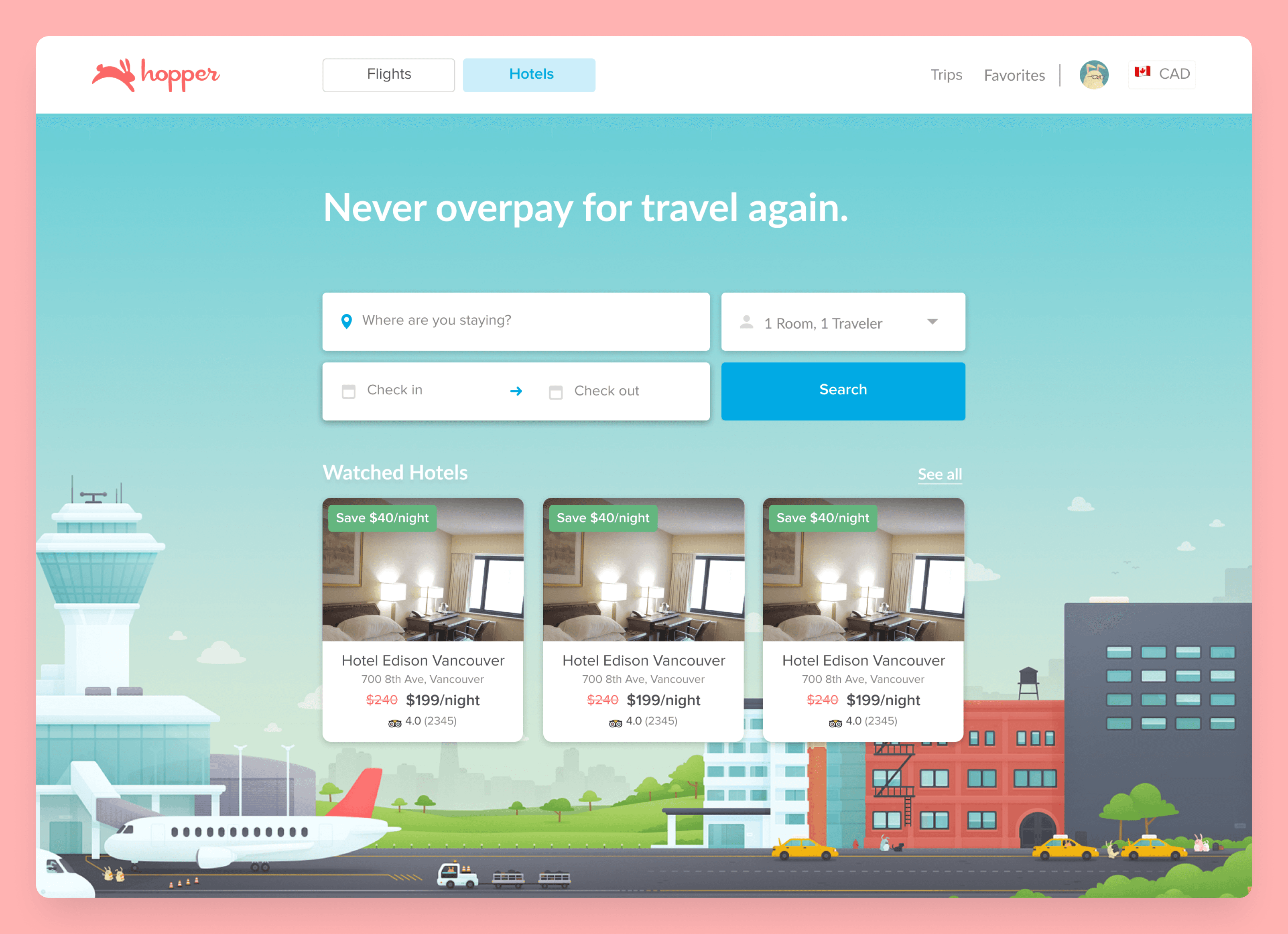
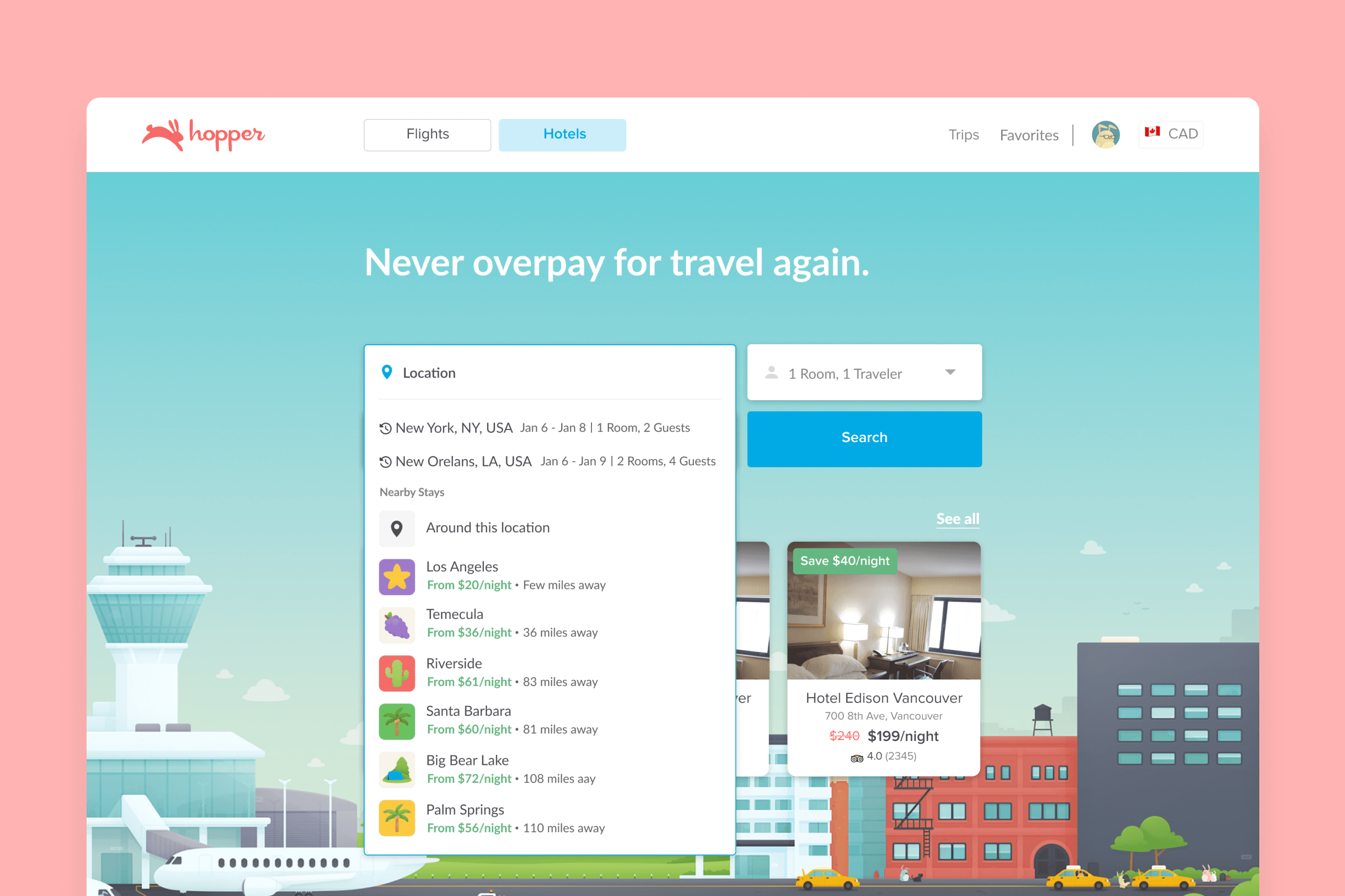
A landing page with 3 main improvements:
  1. Adding a room and traveler counter to the hotel search, there are cases when multiple rooms at the same hotel need to be booked, this would alleviate the need to go through the whole process twice to achieve this goal.

  2. Adding watched hotels to the hotel search landing page to make good use of un utilized space, to let users quickly see the hotels their most interested in.

  3. Adding recent searches and suggested location based searches to the location search dropdown. Doing this will expedite the process if searches need to be made again.


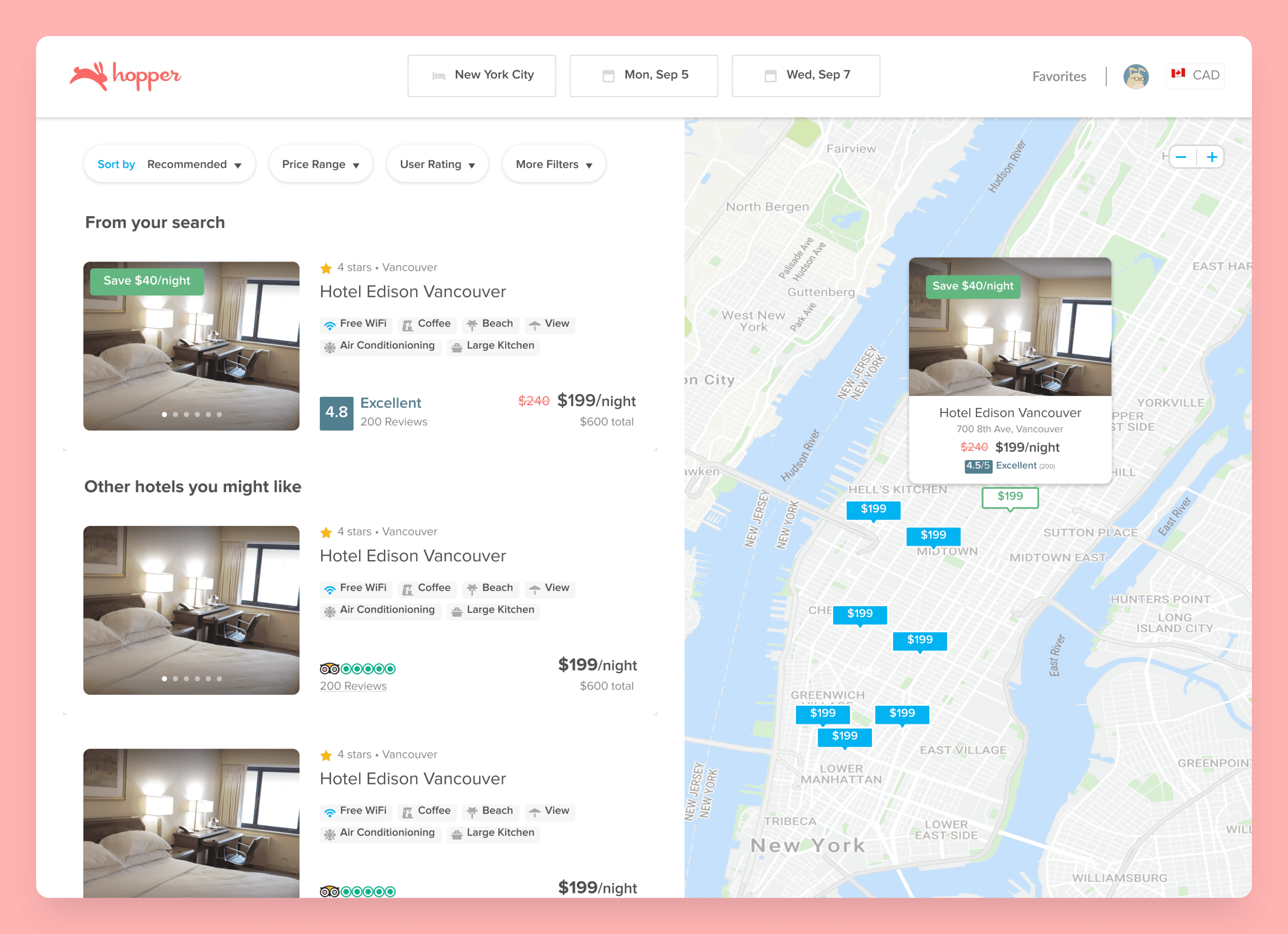
Improved nav & filters

I moved the main search into the nav bar to create a better distinction/hierarchy between the search and filters. I also added the most used filters (based on analytics) to the front, allowing the users to find what they are looking for faster.


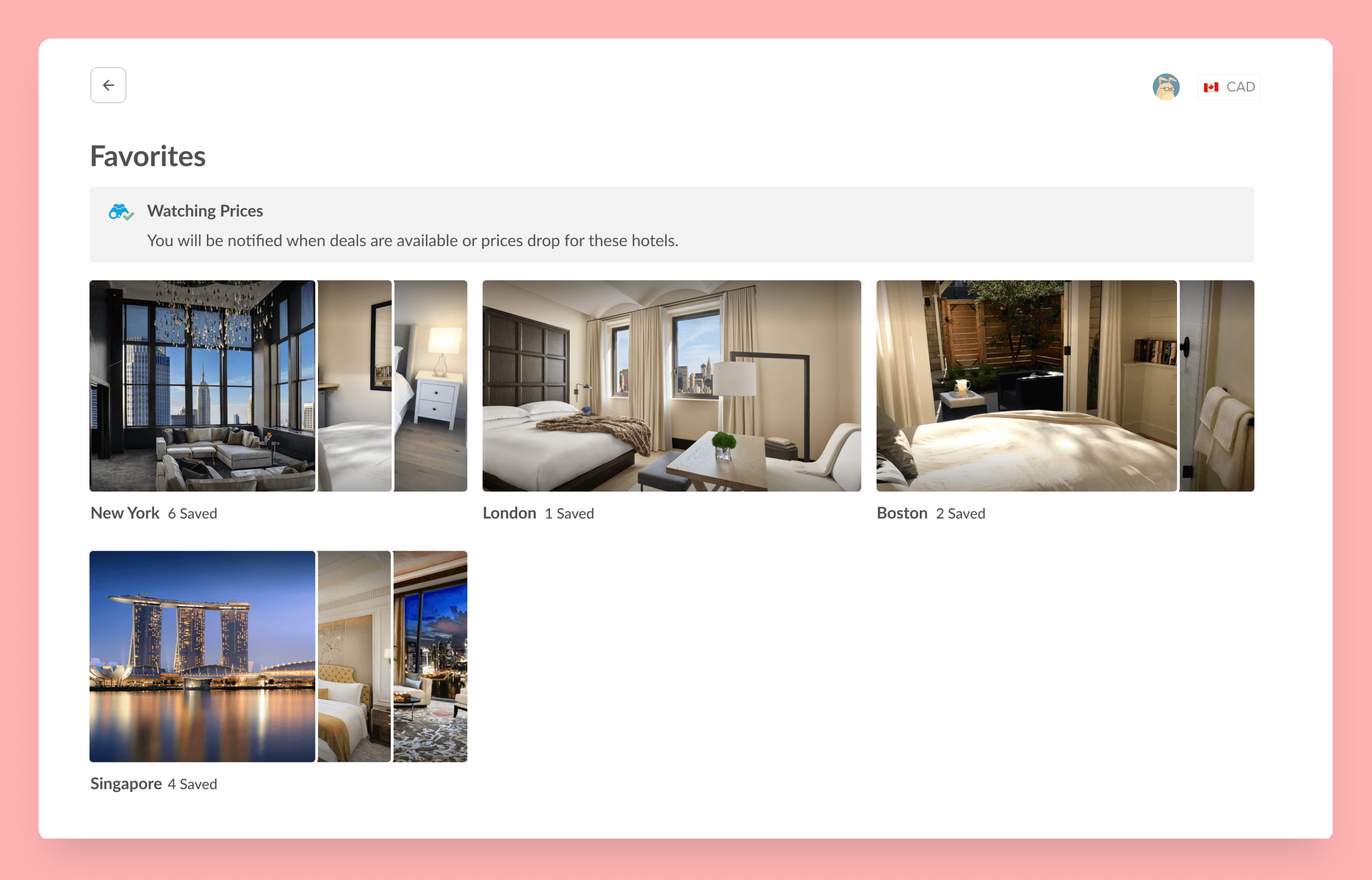
Favorites

I added a favorite list to give users the ability to save hotel prospects in the event that they need to make a decision amongst a few or many chosen hotel options. Most hotel booking platforms offer this feature, making this improvement an important step towards staying competitive. Overall, having a favorites list provides users with a simple yet powerful tool to customize their experience, improve efficiency, and stay organized, thereby enhancing their overall satisfaction with the product or service.


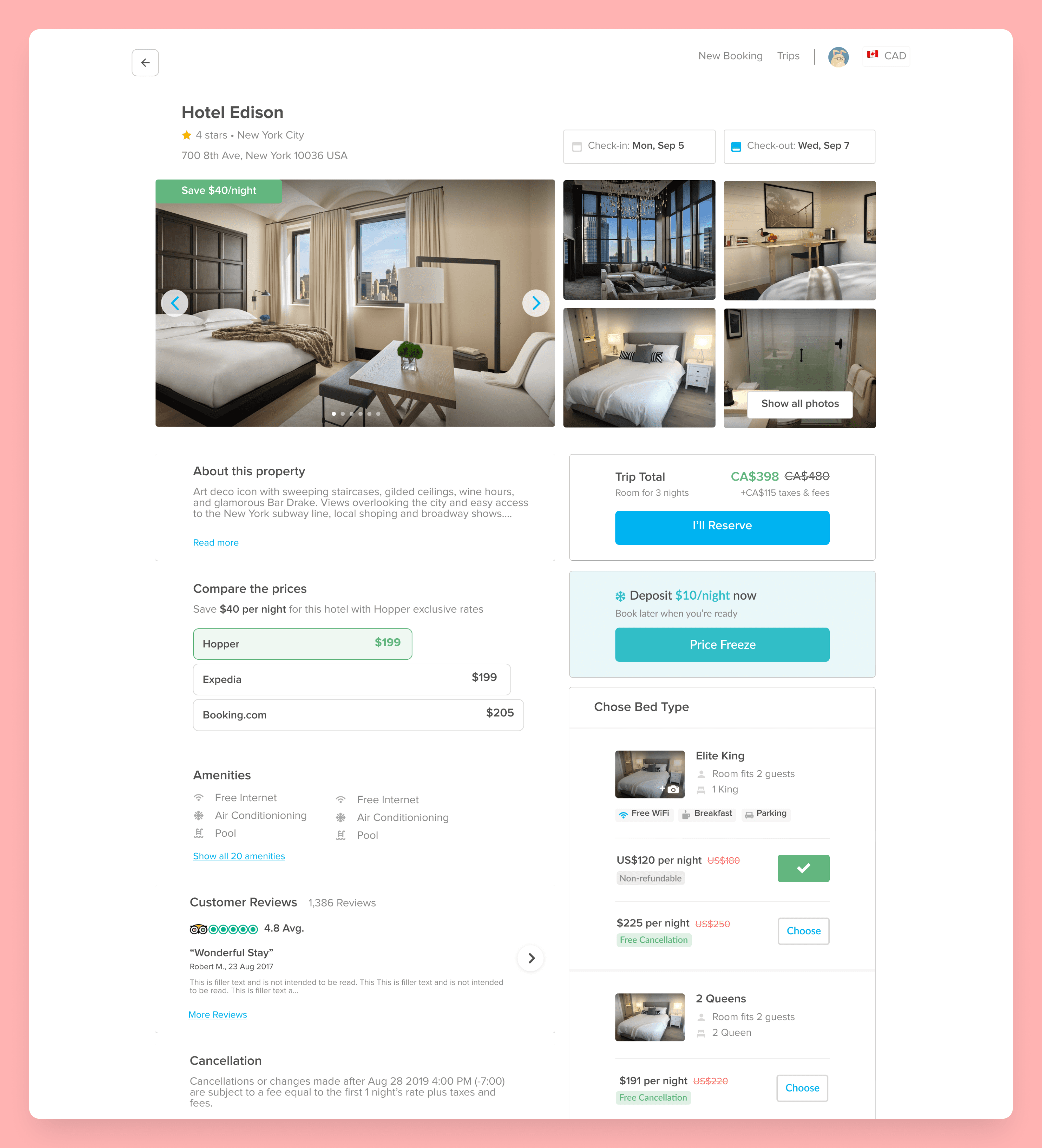
Booking confirmation that works like the mobile app

I took the freeze price feature from the mobile app and optimized it for web as that is one of the mobile app's core differentiating features. When booking you will be given the option to freeze the price for a low daily rate, incase you're not yet ready to commit.
PORTFOLIO

CHECK OUT SOME MORE

CHECK OUT SOME MORE

CHECK OUT SOME MORE

CHECK OUT SOME MORE

Redesign

Desktop

B2B SaaS & Internal tools

Redesign

Desktop

B2B SaaS & Internal tools

Redesign

Desktop

B2B SaaS & Internal tools

Redesign

Desktop

B2B SaaS & Internal tools

New Product

Hardware & Mobile

Consumer Facing

New Product

Hardware & Mobile

Consumer Facing

New Product

Hardware & Mobile

Consumer Facing

New Product

Hardware & Mobile

Consumer Facing