The goal of this redesign is to enhance user experience, improve current offerings, add tools for enterprise users, and create a visually appealing interface.
Timeline
Ongoing
Role
UX/UI Design
UX Research
Background
Andela is a global technology company that builds distributed engineering teams with top software developers from overlooked countries. Andela's client portal is a secure online platform designed to streamline communication and collaboration between Andela and its client companies. It provides clients with access to important information and tools to effectively hire talent and manage their partnership with Andela and their remote development teams.
Problem
In 2023 Andela wanted to expand their product offering to enterprise clients to become the industry's most trusted talent finding platform for enterprise. Our current product offering catered mostly to small business clients and was not yet optimized to handle the needs of larger enterprise clients.
Objective
Lead the research, strategy and design of an end-to-end experience that leverages our current suite of products to help enterprise clients hire seamlessly, with a focus on 3 KPIs:
↑ 50% Increase in hiring conversion
↑ 30% Increase in speed to hire
↓ 13.8% Decrease in time to match

The next step was to conceptualize solutions, but we were overwhelmed with insights so first we needed to start prioritizing solutions and forming a strategy.
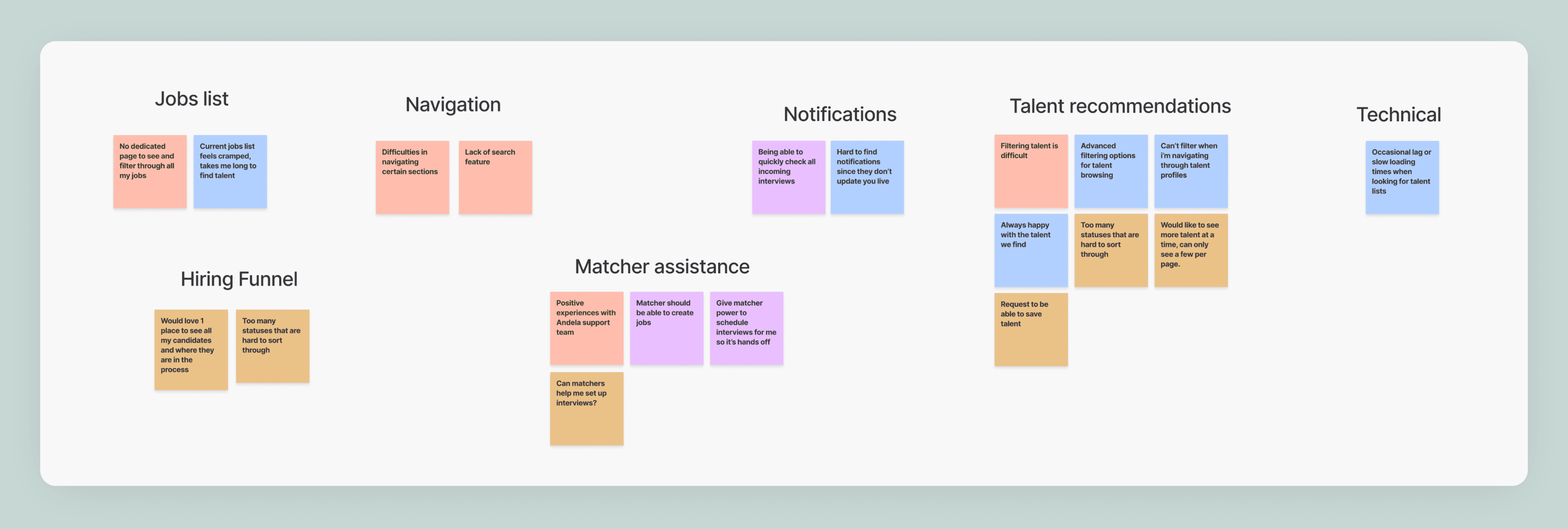
Organizing an affinity mapping session to make sense of the research findings
I organized a working session with cross functional team members to help analyze and sort through all the data that was gathered in the research sprint. I started by laying out all our findings in a fig jam session and started reviewing everything we found with the larger team.

Then we all took a turn looking for patterns and sorting them into themes, naming each group. After several iterations we landed on our final groups, that would in the end inform our proposed solutions.
Mapping out a complex ecosystem of products
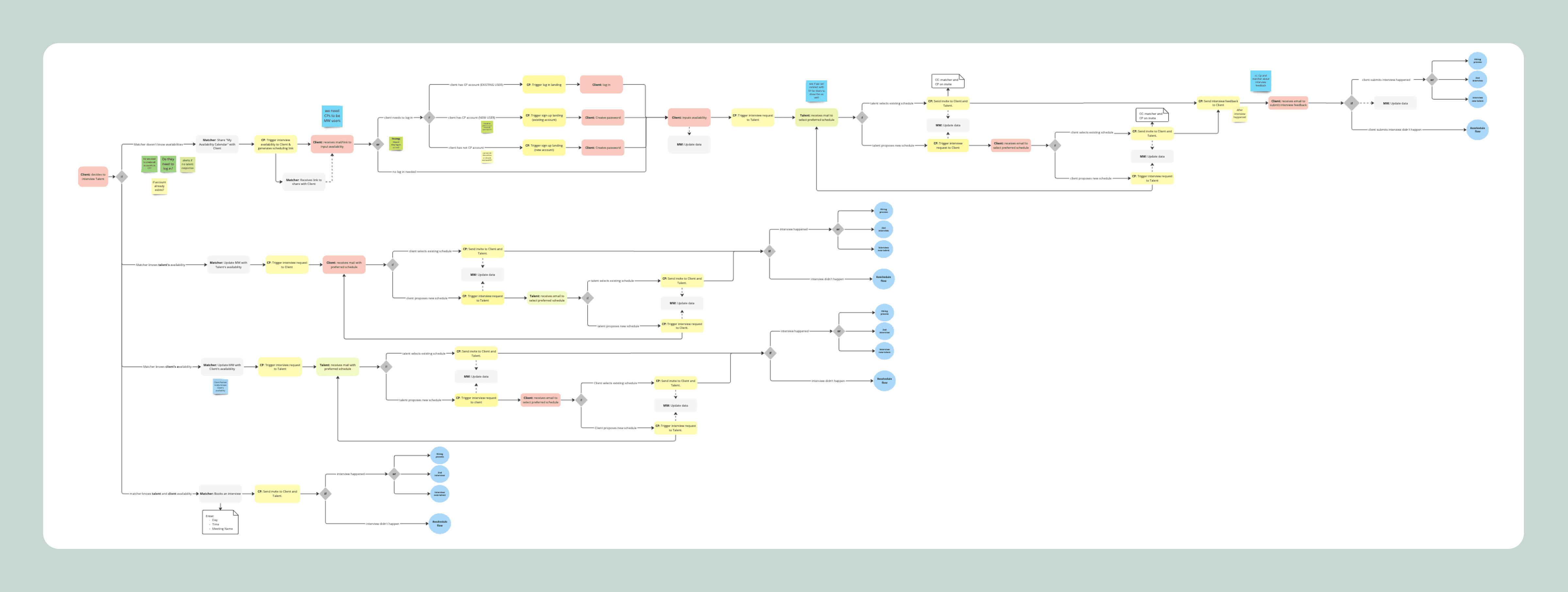
After the affinity mapping session I had a good idea of the solutions we wanted to propose but I first needed to make sure they worked with all the other products in the Andela ecosystem. I mapped out the main interactions between all the products for a holistic view of the system to get a sense of how these new solutions may affect the rest of the products.
Proposing 6 main solutions for this enterprise redesign
A Jobs Page dedicated to all the client's jobs, where they can easily filter & sort the list, as well as view job details, without cluttering the page.
A new Job Posting Experience that makes posting a job faster and easier, with new features like AI generation, uploading existing job post documents and a job post preview.
An improved Talent Recommendations experience to decrease time it takes to find the right talent.
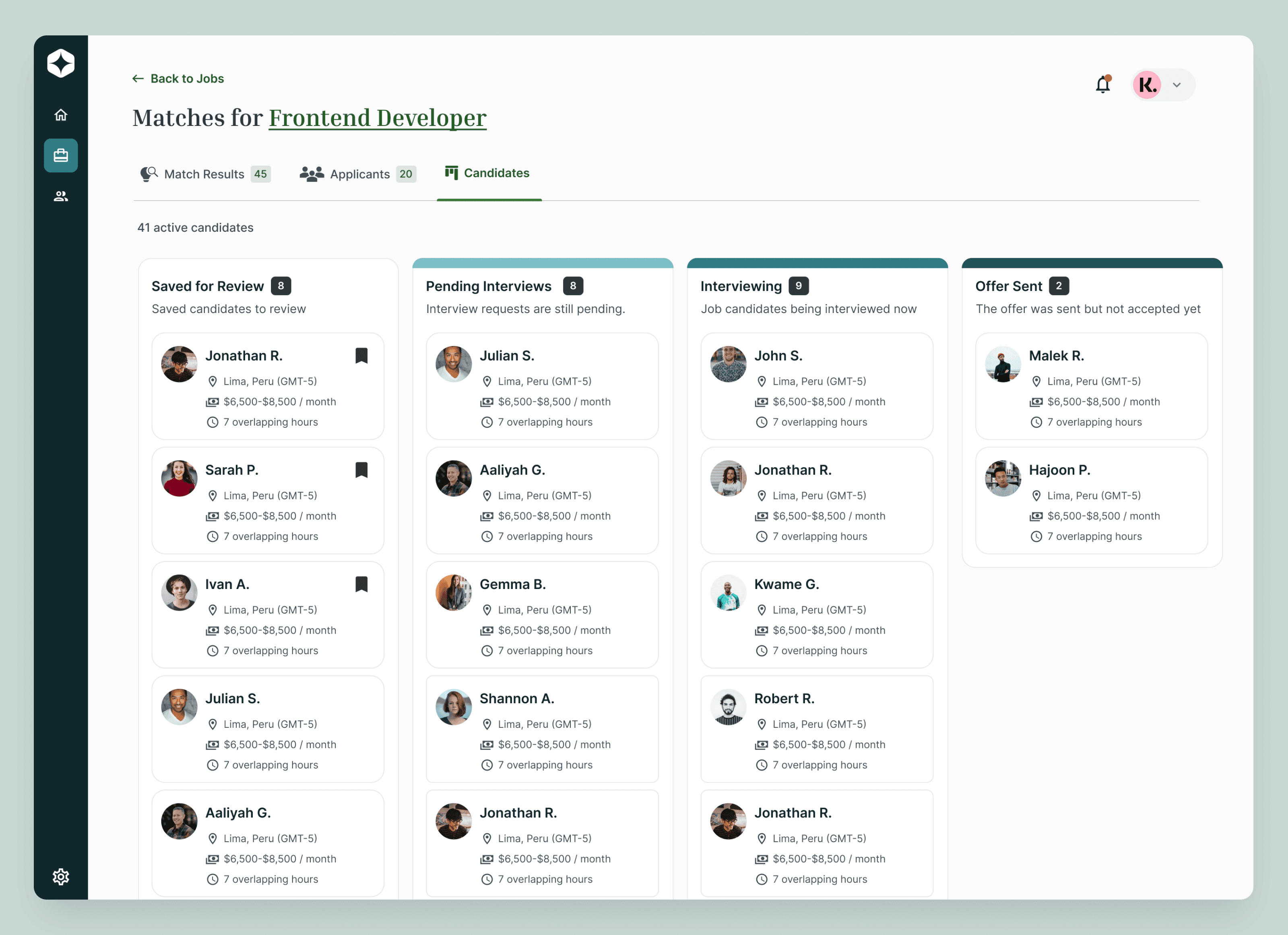
A Candidate Manager, a kanban style board to manage all your candidates in the hiring funnel.
A Notification Center that can be accessed from the nav bar at any point in the experience.
Give internal agents the ability to make Matcher Recommendations.

After thorough research we had landed on the chosen solutions, so it was time to Design
For reference, this was the client portal Before the redesign
Dashboard
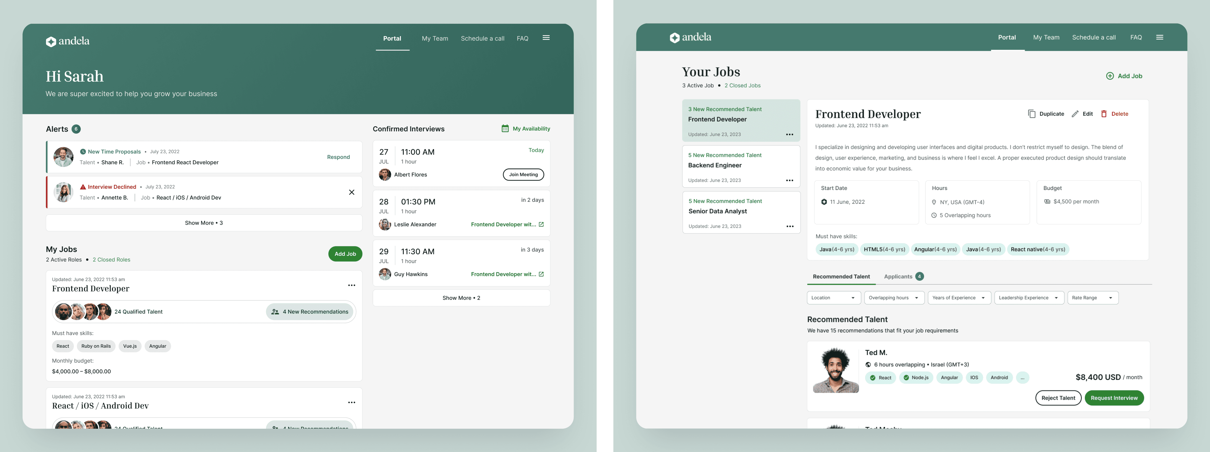
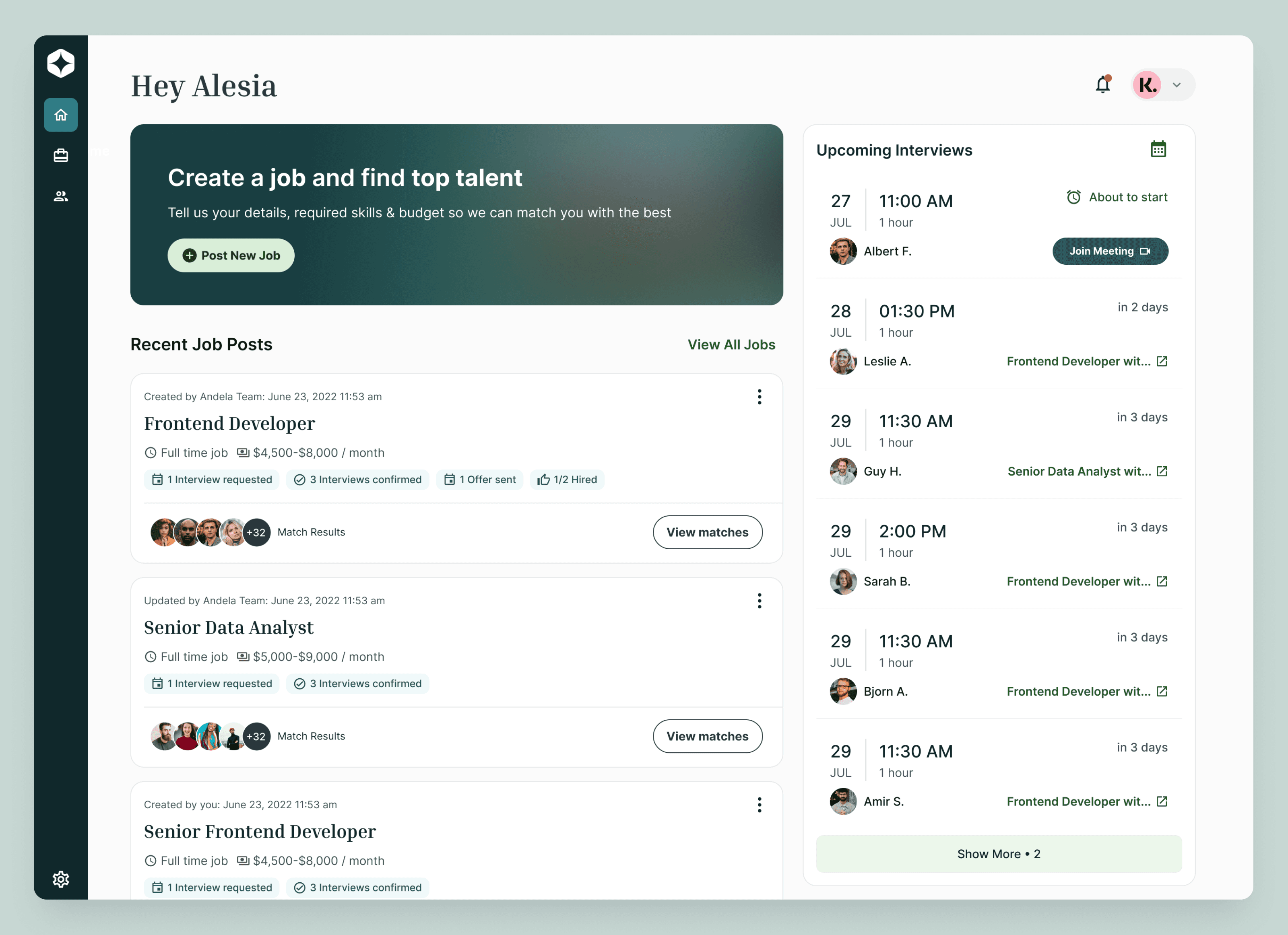
This new dashboard was designed to use the space more efficiently and better highlight important items such as, creating a job, most relevant job posts and upcoming interviews.
Notifications & Navigation
Looking at the data and talking to customers made it clear that a lot of users were having a hard time accessing their notifications and staying up to date. Previously the notifications could only be found as a component on the dashboard making it difficult to access, for this design I made the notifications accessible from every page in the experience by keeping it consistently in the top right.
I've also repositioned the top navigation to a collapsable left nav in anticipation of new features/pages coming to the platform as the top nav was about to reach 5+ items and was no longer scalable.

Jobs Page
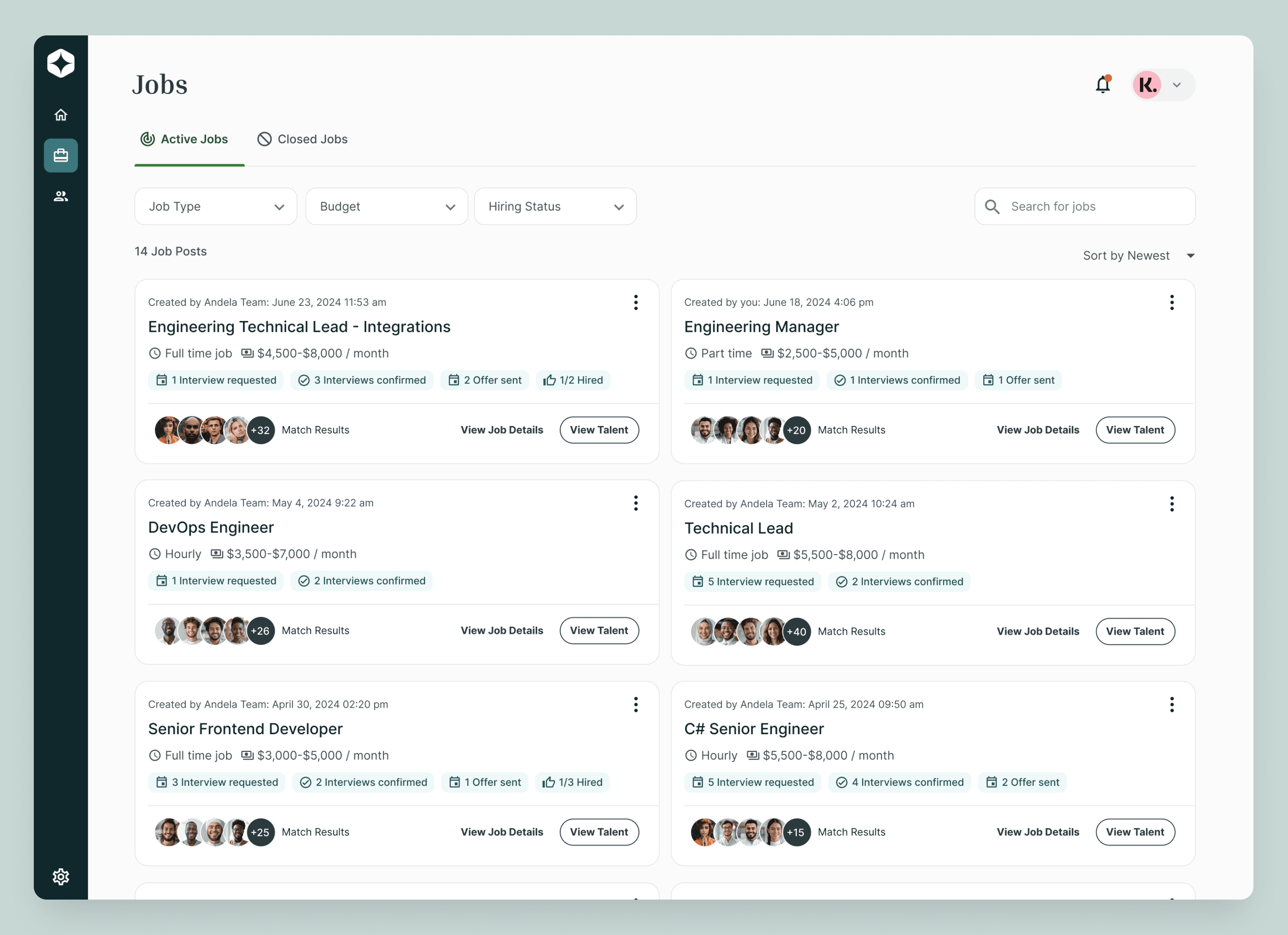
A highly requested feature was the jobs page, previously jobs lived on the dashboard as one long scrollable list that was unfilterable and unsortable, making it extremely impractical for incoming enterprise clients that post jobs in high quantity. With the redesign I had the opportunity to introduce the new feature with the ability to filter, sort and search through your jobs.
Posting a new job
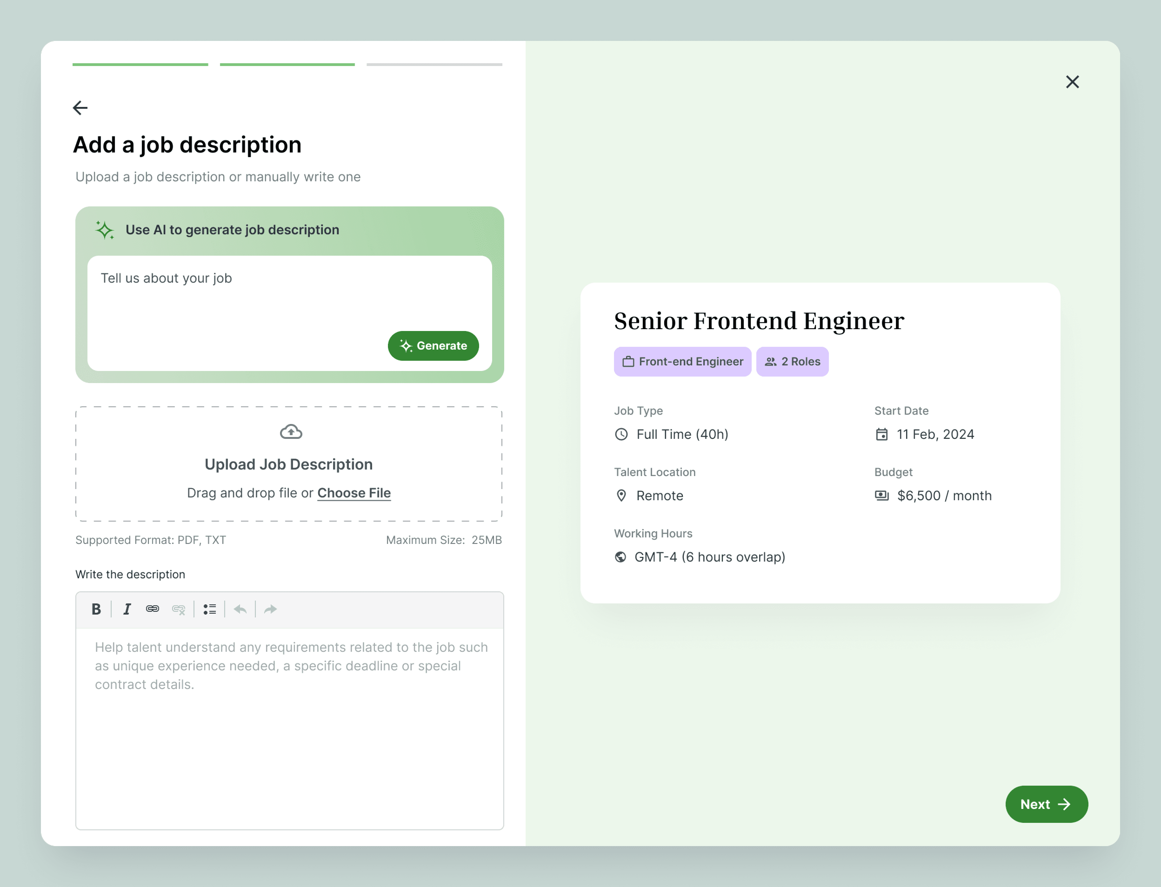
With a goal of increasing speed to hire in the platform, it was important that we make posting a job a quick and easy experience. Some of the improvements I've made here are:
Adding a job post preview to allow you to see the post being built as you go through the steps.
Consolidating 5 steps into 3 main steps: Job information, job description and skill requirements
The ability to generate a job post with AI or uploading a document to be parsed.
A new and improved UI

Talent Recommendations
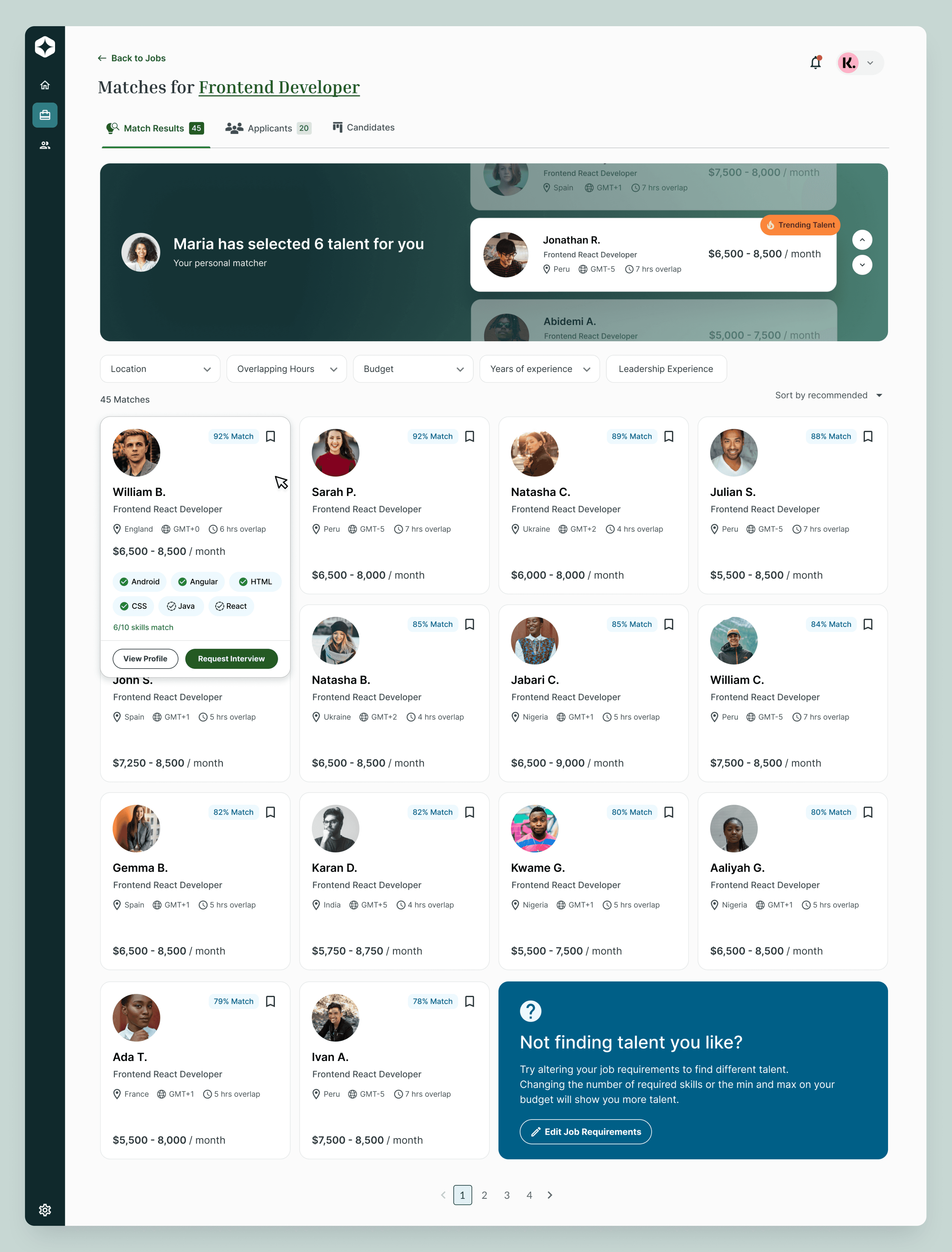
Each job takes you to a dedicated talent recommendation page, where you can easily browse, filter and sort through talent. Browsing through talent recommendations is the main driving factor for clients coming on here, so giving them the right tools to look for their next hire will go a long way in increasing engagement and product adoption. It's now easy to see if a talent is a right fit for your role with the match percentage and hovering over the talent to see how many skills match.
I've also dedicated prominent space to allow matchers, internal agents that match talent and companies together, to recommend talent directly to the client bases on job requirements to increase speed to hire.
Candidate Manager
One of the largest new additions to the client portal is the candidate manager, a kanban style board to view and manage all the talent in your hiring funnel. Since data tells us that enterprise clients interview and hire in large quantities this feature was a necessary addition to the platform to provide a clear, visual representation of the hiring funnel, making it easy to see which saved talent, talent that are interviewing, or talent with pending job offers.

The Redesign has been successfully Delivered and launched. All that was left was to monitor the progress and make improvements & fixes when needed
Monitoring usage & Checking in with clients
To watch how the new redesign was being used I made use of Fullstory to watch sessions of our clients interacting with the experience. I also had access to review calls, using Gong, between our product representatives and clients for check ins where they ask follow up questions about the new experience. With the data collected I was able to continuously improve the product after launch.


